UBER – the apps based transportation network – announced their new look and feel.
The much familiar ‘U’ has been replaced with colorful geometric icons that are different for drivers and riders.
![]()
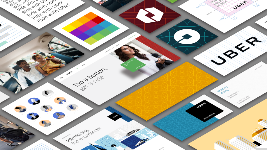
The new logo is a circle with a square in the middle set for riders. And the second icon is a hexagon with a square in middle which has been designed for its drivers. With time, the company aims to create patterns and colors unique to each market. Example: red in China, turquoise in India, dark teal in the United States.
Some of the fans weren’t impressed with the new look and took to social media to voice their views.
![]() I think the older UBER logo had more punch. The ‘U’ came across as a more memorable icon for the firm which, despite being 400-city strong, still has a very long way to go. The new icons could be hard to spot among myriad of others on our devices.
I think the older UBER logo had more punch. The ‘U’ came across as a more memorable icon for the firm which, despite being 400-city strong, still has a very long way to go. The new icons could be hard to spot among myriad of others on our devices.

- Key Steps in Email Marketing - July 23, 2024
- What is brand identity for the business startups? - May 11, 2024
- Why every business needs branding? - May 11, 2024